Ashish Singh Resume
Case study · Away · Concept for heyaway.ai

The flight list, reimagined
as a friend who negotiates.

Away is a flight-booking app. I rebuilt the booking flow around one idea: an agent that finds your flights and haggles the price down for you, so the price you see is the price you pay. Below is the whole journey, screen by screen, and the thinking behind each one.

Experience the prototype
RoleProduct design & strategy (concept)
WhereAway · heyaway.ai
ScopeEnd-to-end flow, 11 screens, live prototype
81 → 24
options sifted to a calm shortlist
₹2,900
top saving haggled, live on the card
₹0
added at checkout — you pay the price you saw
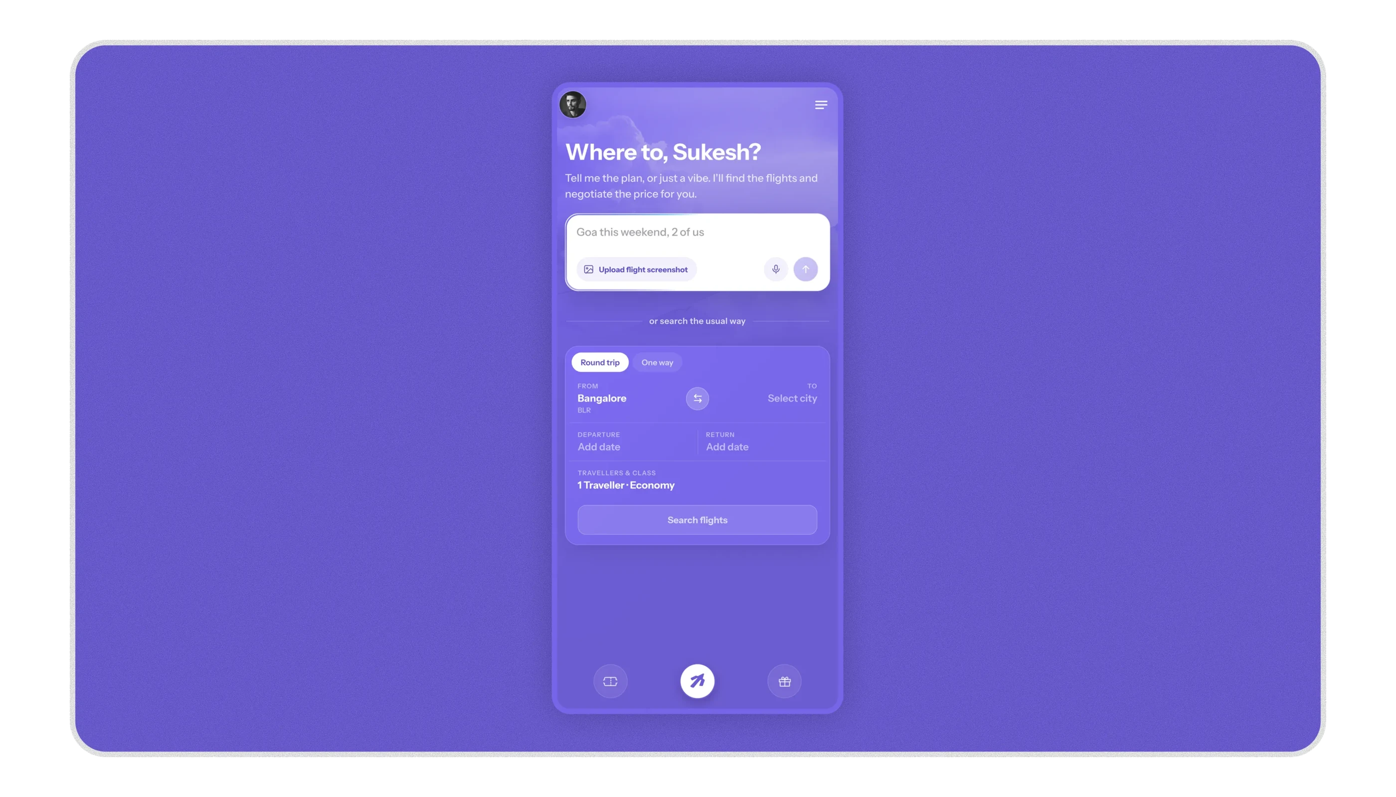
Away v3 — the negotiate-first home screen, shown on a phone
The problem

Booking a flight is a hunt built on distrust.

The price you see is almost never the price you pay. It looks fine on the results page, then climbs at checkout as fees and a seat get bolted on. And the genuinely best deal for the same flight is scattered across countless sellers, each with its own quiet discount, more than anyone has the time to check.

So you do the only thing you can: you hop from app to app, comparing, second-guessing, and still book without ever being sure you got a fair deal. The whole experience is designed to be worked, and you feel it.

What you see isn't what you pay
The number moves against you between search and checkout. That single gap is what quietly teaches you not to trust a booking app.
The best deal is buried
The same seat sells in a thousand places at a thousand prices. Finding the real best one is a full-time job no traveller actually has.
The idea

Not a marketplace. A friend who works for you.

Most travel apps behave like a marketplace: they dump every option on you and leave you to do the work, so you feel alone and a little used. Away behaves like a friend who happens to work in the industry, someone who checks everywhere, haggles on your behalf, and comes back with the one deal that's right for you, at a price you can trust.

The reason that isn't just a slogan: Away makes no margin on the flight itself. There is no cheaper seat it's hiding and no pricier one it's nudging you toward. Its only job is to get you the best deal, which is exactly what makes the "friend on your side" feeling structurally true.

The task I set myself was to make every screen behave that way. So I designed the flow one screen at a time, and here it is.

The flow, screen by screen

From opening the app to a booked ticket.

Eleven screens, each with one job. For every one: what the user sees, why it's built that way, and the feeling it's designed to create.

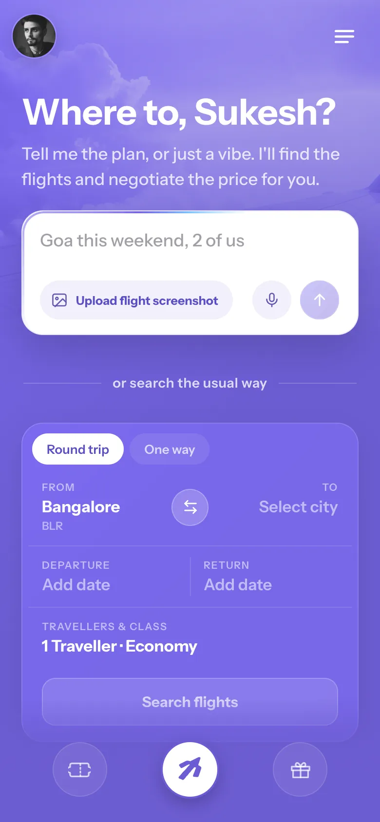
Entry screen — an intelligent search with the usual form right below
1

One intelligent search, and the usual one right below.

Feeling: wait, what is this? → oh, I get it, and my usual way is still here.

What the user sees first

The home screen leads with a new, easier way to search, and keeps the familiar one right below it. You can speak or type your trip in plain words, paste a screenshot of a flight you already found, or use the normal search form everyone already knows. Nothing here asks anyone to learn a new way to book.

The features, and why each exists

  • Speak or type, in plain words. "Goa this weekend, 2 of us" is enough. You can even be loose with dates, like "Mumbai to Delhi between the 4th and 6th," and it still gets it.
  • Helper text that teaches as you go. The placeholder quietly rotates real examples, so within a second you see you can just talk. No tutorial to read.
  • Paste a flight screenshot. Already have a flight in mind from another app? Drop the screenshot in and land straight on that exact flight, ready to negotiate.
  • The usual search, right there. From / To, dates, travellers and class sit just below, so the familiar path is always one glance away.

The feeling I designed for

Anything new gets the same first reaction: "wait, what am I supposed to do here?" So the screen answers that in the first second. The new way is front and centre, the helper text shows exactly what to say, and the familiar form sits below as a safety net, so you never feel lost and give the new thing a real try.

Feels familiarNothing new to learnA safety net right below
One conversation — every entry point continues in the same thread
2

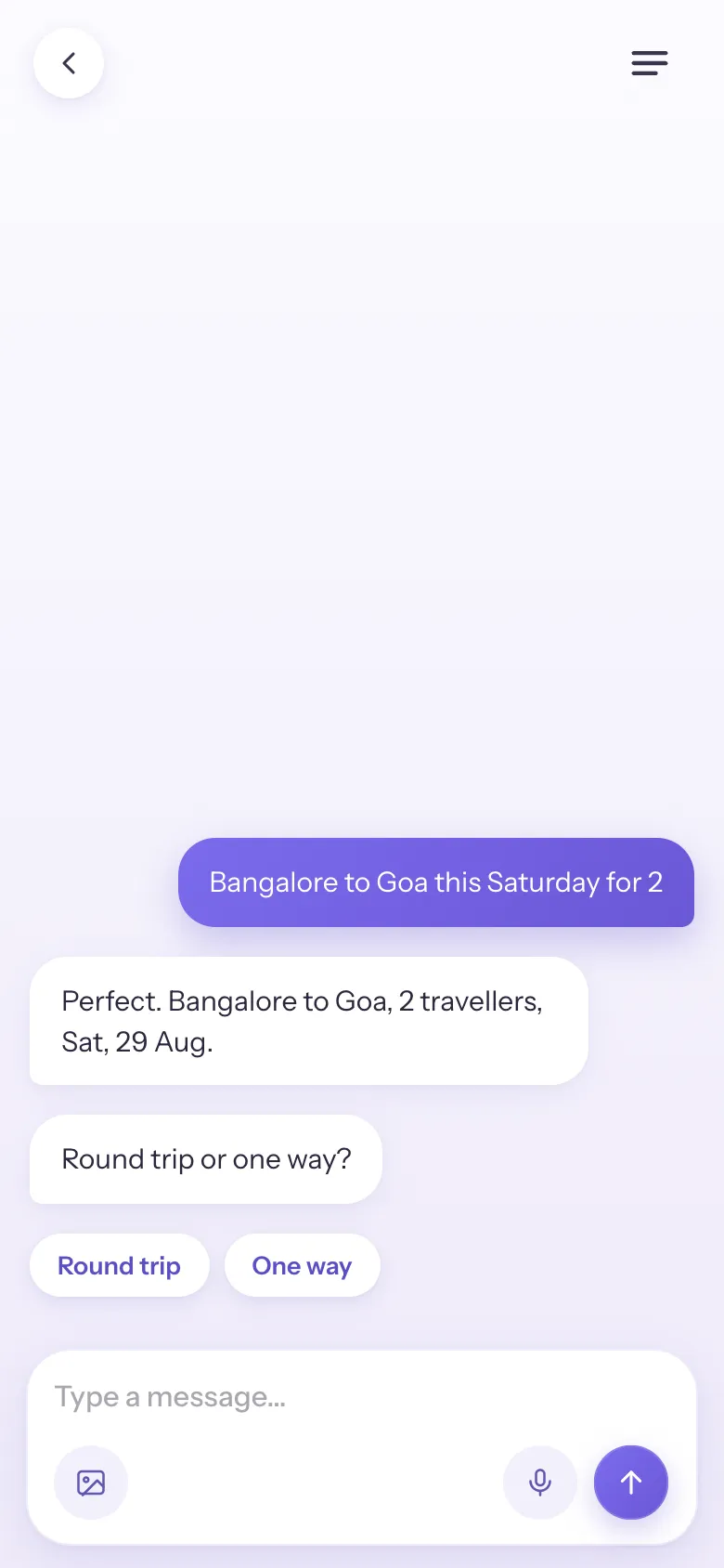
It starts a conversation with you, like a friend.

Feeling: this isn't a tool, it's someone helping me.

Why every entry leads to one place

The home screen offers a few ways to start, speaking, typing, pasting a screenshot, or using the form. But those are just entry points. Whichever one you pick, it all continues in the same conversation. One way in shouldn't open a chat and another drop you on a different screen, that's where a flow feels broken and people get lost. So every entry leads to the same place.

Why it's a conversation, not a form

A conversation makes it feel like you're with a friend who works at the airline, not operating a tool. It talks back, repeats your trip so you know it understood, and stays in one calm thread the whole way.

Why it reads from the bottom

The conversation sits low, in the thumb zone where the hand rests, so your first message and quick choices (round trip, cabin) stay within easy reach and everything is one-handed. The thread grows upward as it goes.

Feels like a friendOne consistent flowEasy to reach with your thumb
Finding your flights — a short beat that shows the real work
3

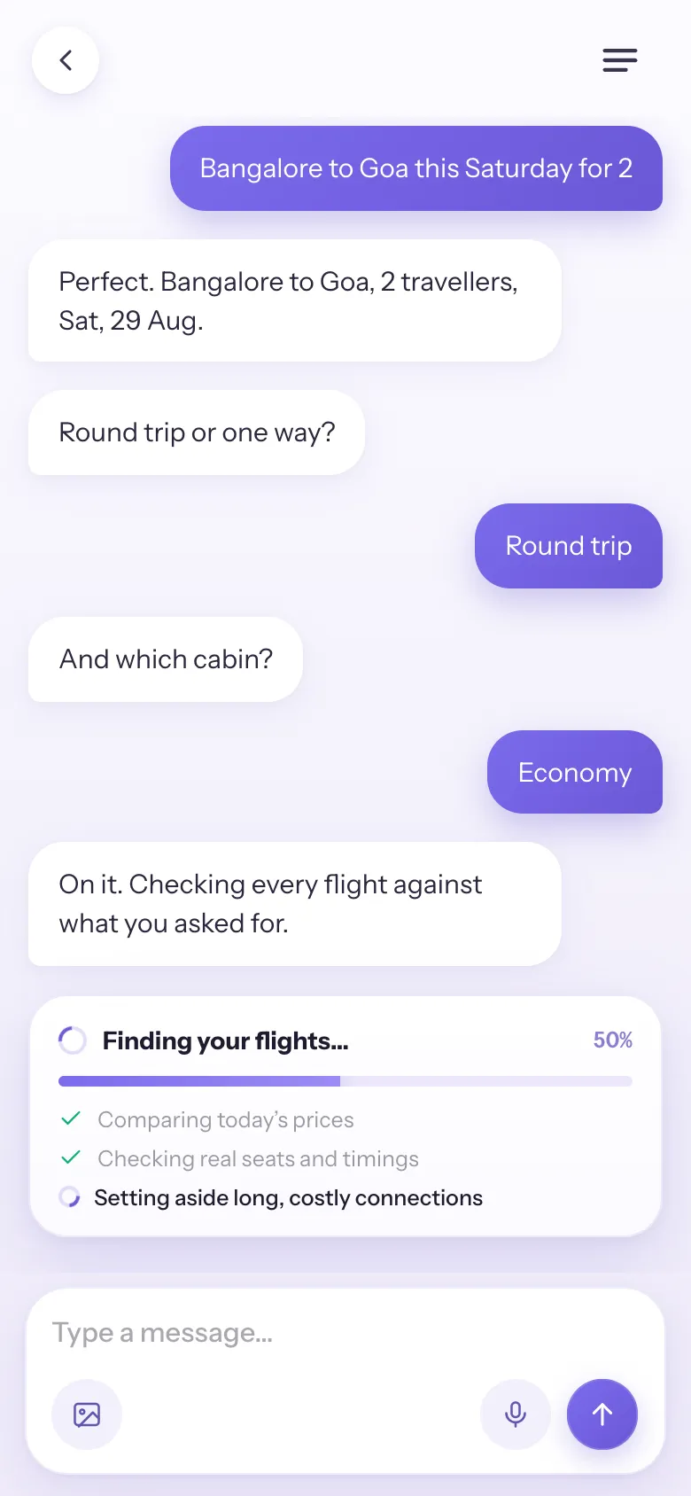
Finding your flights, showing the work.

Feeling: nice, someone is on it for me.

What it does

A short, honest beat that surfaces the real work: pulling live fares across airlines, checking seats and timings, setting aside the long and overpriced ones.

Why it works

When you can see the work happening, you value the result more and trust it more. This isn't a fake loader, it's work that's genuinely going on, so the shortlist that follows feels earned, not random.

Showing the work builds trustKeeps you engaged while it loads
The reveal — the funnel from 81 results down to 24 that make sense
4

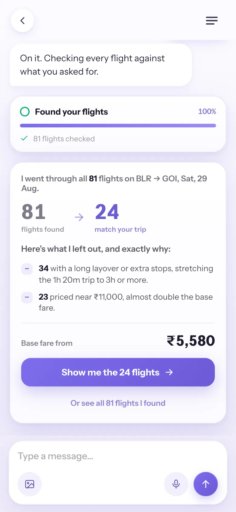
The reveal, from too many to just right.

Feeling: relieved, I can trust this.

What it does

Instead of dumping 81 results on the screen, Away shows the funnel. It went through all 81 flights, then says exactly what it left out and why: 34 add a long layover that stretches a 1h 20m trip past 3 hours, and 23 are priced near ₹11,000, almost double the base fare. It kept the 24 that make sense, from ₹5,580, with one button to see the shortlist.

Why this moment matters most

This is where people freeze: too many options, and it gets harder to feel good about any of them. Showing why each flight was left out answers the quiet worry "did it hide a better one?" You read the reasons, agree with them, and make the call yourself, which turns doubt into trust.

Fewer options, less stressNothing hiddenYou make the call
The flight list — a short, calm, hand-picked set of cards
5

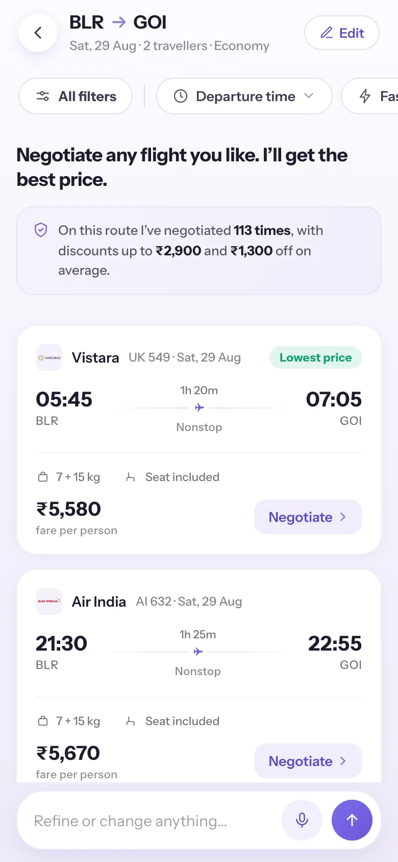
The list, the most important screen, kept calm.

Feeling: calm, and there is no wrong choice.

Every element earns its place

  • Generic, editable header (From → To · date · travellers · class). A familiar pattern that orients instantly and signals you can change anything.
  • "Negotiate any flight you like." The headline sets the deal, you pick, it negotiates, and "any" removes the sense of a single-choice trap.
  • Track-record banner ("negotiated 113 times, up to ₹2,900 off"). Quiet proof the negotiation is real and works.
  • Clean cards, one green "Lowest price" flag. A single standout instead of a wall of badges, so the cheapest fare is obvious without noise.

How it keeps things light

This is where flight-hunting normally gets stressful, so the screen's whole job is to feel light: a short set, one accent colour, plenty of space, and calm cards with no loud buttons. And choosing is easy because you arrive already confident, the previous screen showed the junk being sifted out, so you land trusting every option is a good one.

Clean feels easierOne thing stands outLess clutter
Filters — a few levers out, the rest one tap away in a sheet
6

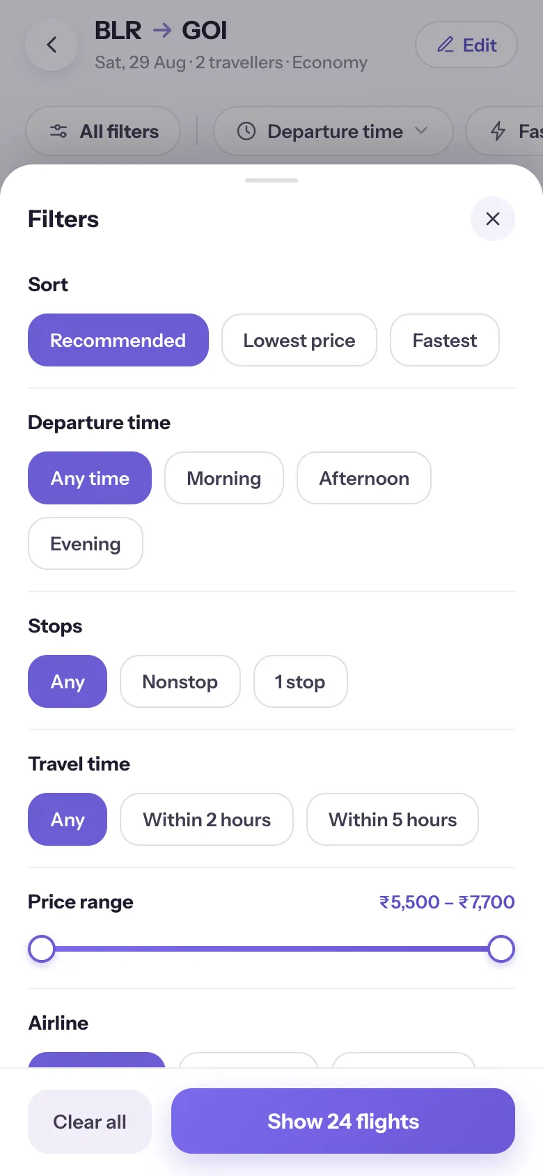
Filters, a few levers out, the rest tucked away.

Feeling: in control, not overwhelmed.

What's out, what's tucked away

Only the filters people reach for most stay in the bar, Departure time, Fastest, and Lowest price. Everything else sits one tap away in a clean "All filters" sheet (Sort, Stops, Travel time, Price range, Airline) that shows a live count of matches. It's the same pattern people already know from Airbnb and Blinkit.

Why so few up front

Putting every filter in the bar would be a wall of choices before you've even looked. Keeping just the few you actually use out front, and the rest a tap away, makes it easy to decide without taking control away from people who want more.

Fewer choices up frontThe rest one tap awayA pattern people know
Negotiation running in place on the flight card, saving climbing live
7

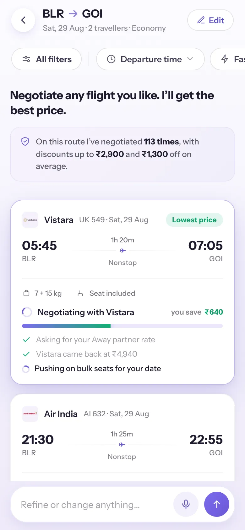
Negotiation happens right here, no page jump.

Feeling: someone is fighting for me (the best bit).

What it does

Tap a flight and the negotiation runs in place, on the card itself, a real-feeling back-and-forth (the airline's partner rate, bulk seats on your date, alliance & hidden-city fares) with the saving climbing live. The rest of the list stays exactly where it was.

Why the same screen makes it better

You're never thrown into a separate flow, so nothing feels disconnected, and you're not locked into one pick, you can tap several flights and run the negotiations at once, each on its own card, then watch the prices land side by side. It all stays on one screen, so you get to play with it, feel the little rush of prices dropping, then book the one you like best.

No page jumpNegotiate several at onceFeel the win each time
The negotiated fare — final price in green with a You saved chip
8

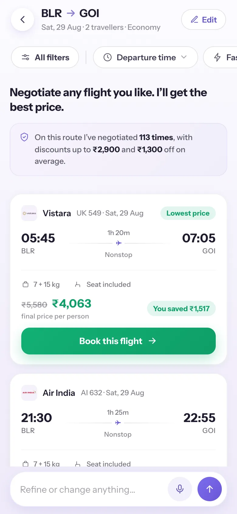
The win, made unmistakable.

Feeling: yes, I got a deal.

What it does

The fare per person strikes through and the final price per person lands in green, with a clear "You saved ₹X" chip, then a single, warm CTA: "Book this flight."

The psychology

The reward is instant and real. Seeing the exact rupees saved makes all the waiting feel worth it and the choice feel smart, the moment the whole app is built to deliver.

Instant rewardReal numbers build confidence
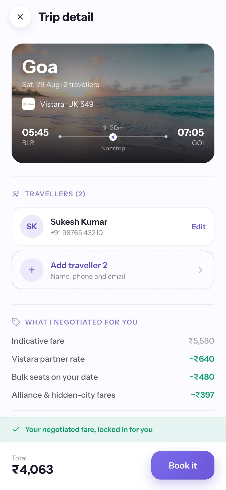
Trip detail — travellers and the full negotiated breakdown before you pay
9

The details, all clear before you pay.

Feeling: wait, is this legit? → okay, I feel safe.

What it does

Everything sits on one clear page before payment. Up top, the travellers on the trip, with the account holder already filled in and a tap to add anyone else. Below that, exactly what was negotiated, the partner rate, bulk seats, alliance and hidden-city fares, then seat, baggage, and "your negotiated fare, locked in." Nothing is added at checkout: the price you see is the price you pay.

The psychology

The one moment people get doubtful is right before the money leaves. Seeing who's flying, the full breakdown, and the same story the live negotiation told, all on one page, earns the last bit of trust.

Everything on one pageTravellers set herePrice you see = price you pay
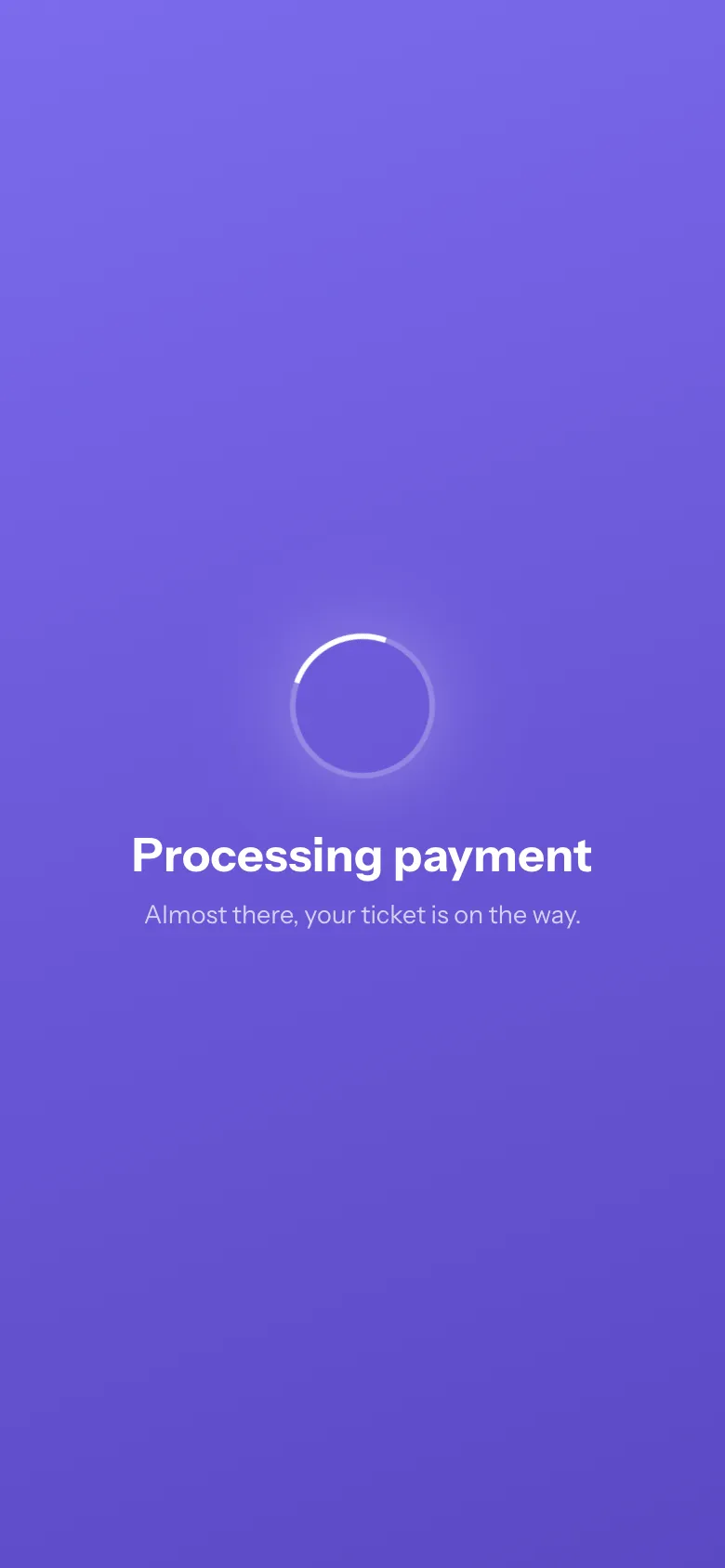
Payment — reassurances that cycle through as the booking goes through
10

Payment, locking in your win.

Feeling: the nervous wait, made calm.

What it does

By this screen you've already committed to the amount, so the anxiety isn't about price, it's "will it go through, and am I really getting my ticket?" The wait cycles through reassurances that answer exactly that:

  • "Taking your payment securely…" the transaction is safe and in motion.
  • "Confirming your seats with Vistara…" the airline side is happening too.
  • "Your booking is going through…" the direct answer to "did it work?"
  • "Almost there, your ticket is on the way." the outcome is coming; sit tight.

The psychology

A plain spinner leaves you imagining the worst, paying and getting no ticket. Telling you what is actually happening (payment safe → booking confirmed → ticket on the way) removes the doubt and turns an anxious wait into a calm one.

Calms you while you waitTells you what is happeningLess worry, more excitement
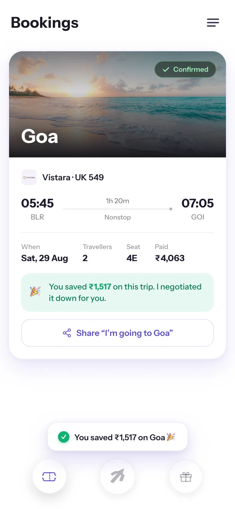
Confirmation — a real destination photo, the saving, and a one-tap share
11

The ending, the second high point.

Feeling: proud, and I am actually going.

What it does

The destination in a real photo, a calm "Confirmed," the trip details, and the payoff front and centre: "🎉 You saved ₹1,517 on this trip. I negotiated it down for you," plus a one-tap "I'm going to Goa" share.

Why it closes the loop

People remember the last moment most. The app exists to save you money by negotiating, so the finish line celebrates exactly that, taking you from relieved to proud, and giving you something worth sharing.

The ending sticks with youFeels like a winWorth sharing
The emotional arc, by design

Every screen moves you one step along the feeling.

From the stress of booking to the pride of a deal done for you. Each screen has one job, to carry you to the next feeling.

CuriousYou land on a new way to search, with the familiar one right there as a safety net, which frees you to wonder what this new thing can do.
UnderstoodIt starts a conversation and repeats your trip back, so you feel heard, not processed by a machine.
Looked afterIt sifts a surge of fares, drops the slow and overpriced ones, and hands back only the few worth your time. The hard part, done for you.
CalmThe shortlist is short and every option is already good, so there's no wrong choice to make.
ThrilledThe negotiation plays out live on the card. Someone is actually fighting to get your price down.
ExcitedThe lower fare lands and the saving is impossible to miss. That's the payoff.
CarefulYou add the travellers and check the trip, with everything laid out clearly before you pay.
ReassuredHanding over money is the uneasy moment, so it stays calm, holds the price you were promised, and keeps telling you it's going through.
ProudThe ticket is on its way and the saving is yours to celebrate. It's all handled, and you came out ahead.
The takeaway

Every travel app optimises for the next booking. The harder, more valuable thing is to earn trust, screen by screen, so honestly that you stop checking other apps at all. That is the product.

Because Away makes no margin on flights, the "friend on your side" wasn't a tagline I had to sell, it was structurally true. Every screen just had to live up to it, in what the user feels.